


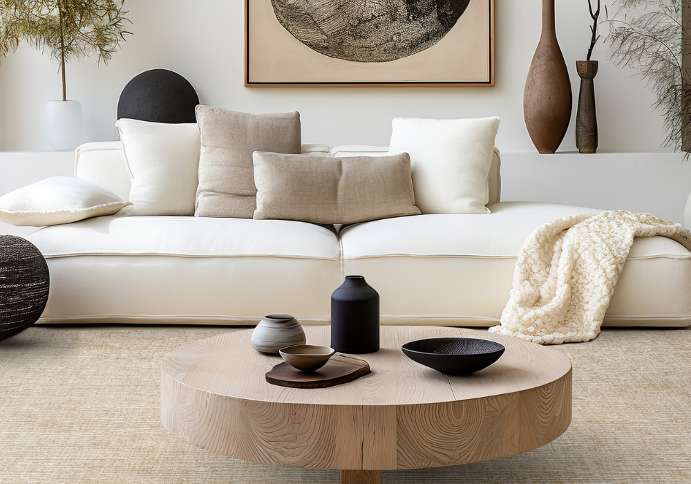
Walk into any room and your eyes do something instinctive. They trace the floor up to the walls, then back down again, taking in the whole picture before you even realize it. That quiet conversation between carpet and paint shapes how a space feels long before furniture or artwork enters the equation. Get the pairing right and a room settles into itself. Get it wrong and something always feels a little off, even if you can't name it.
At Wally's Carpet & Tile, we've been helping families in the Inland Empire find that balance since 1954. From our showrooms in San Bernardino, Yucaipa, and Upland, plus a shop-at-home service that reaches Rancho Cucamonga and beyond, we walk homeowners through the colors and textures that turn a house into a home. Choosing the right carpet is only half the story. The other half is making sure it lives well alongside the walls around it.
The quiet conversation between floor and wall
Color theory can sound intimidating, but the basics are friendlier than they seem. Most successful pairings come down to balance: warm with cool, light with dark, calm with character. Think of your carpet as the foundation and your walls as the backdrop. When one speaks loudly, the other should listen.
Start with the carpet, then choose the paint
Most homeowners pick paint first, but that approach often leads to regret. Carpet comes in fewer color variations than paint, and matching a wall color to thousands of fan-deck options is far easier than the reverse. Build from the ground up and your choices open up rather than narrow down.
We always suggest browsing your favorite flooring products before committing to a paint chip. Once you've narrowed down the carpet tone, the wall colors that complement it will start to reveal themselves naturally.
Light walls with deeper carpet
This combination is a classic for a reason. A creamy or soft white wall makes the room feel open and airy, while a richer carpet in warm taupe, espresso, or charcoal grounds the space and hides everyday wear. The contrast adds depth without feeling heavy, and it suits everything from traditional to modern interiors.
Families with children or pets often gravitate toward this pairing because darker carpet shows less daily life. The bright walls keep the room from feeling closed in, while the floor does the practical work.
Warm tones, cool tones, and how to mix them
A foolproof rule: keep your undertones consistent. Warm carpets in honey, sand, or rust sing alongside warm whites, soft greens, and muted terracotta walls. Cool carpets in slate, dove gray, or blue-gray pair beautifully with crisp whites, soft blues, and silvery sage. Mixing warm and cool can work, but it takes a careful eye.
If you're not sure where to start, a few combinations rarely miss:
- Greige carpet with warm white or soft sage walls
- Charcoal carpet with light dove gray or muted blush walls
- Cream carpet with deep navy or forest green walls
- Mocha carpet with creamy ivory or warm beige walls
Don't forget about texture
Color is only one layer of the picture. A plush cut-pile carpet reflects light differently than a low loop or patterned weave, and that changes how the wall color reads in the room. A flat matte paint beside a high-pile carpet feels cozy and enveloping. A satin finish beside a tighter loop feels crisp and tailored.
Natural light shifts everything too. Hold samples against your walls in the morning, at midday, and after sunset. Colors that look identical in the showroom can behave very differently at home. A shop at home appointment was built for exactly this, bringing the showroom to your living room so you can see the pairing in real conditions.
Find the right pairing with help from our team
When you're ready to test colors in your own home, we'd love to help you compare, sample, and decide with confidence. Take a look at the flooring services we provide and reach out whenever you'd like to start the conversation.